There are quite a few principles and elements of design which consist of :
Principles such as:
Firstly, contrast where two opposing colours or shapes are used to emphasize one over the other. For example, a black background and a white heart. The heart will be standing out because it contrasts the black background.
Source: http://ak0.picdn.net/shutterstock/videos/3365429/preview/stock-footage-dynamic-white-hearts-s-animation-on-a-black-background-great-for-keying-or-masking.jpg
The second principle is balance. It is necessary for so that the picture doesn't look lopsided or heavy to only one side. It is similar to the principle of math where one side's "weight" equals the other side. Also, it then requires the shape to be 'squarely in the middle' of the frame.
Source: http://blogs.office.com/cfs-filesystemfile.ashx/__key/CommunityServer-Components-ImageFileViewer/CommunityServer-Blogs-Components-WeblogFiles-00-00-00-00-43/3683.balance.jpg_2D00_550x0.jpg
Thirdly, there is alignment which is similar to balance because it requires equality. It is either that the words, pictures or shapes are on the left or the right of the whole picture.
Source: https://blogger.googleusercontent.com/img/b/R29vZ2xl/AVvXsEh7V5V2oal9psf3rtx2fASS06hywjNd33exA0Tzu7pRX4kfNByFblwOR0elIftpkMUp1SkfbizX3XuDr0rQfrVc-L-Hq5yRzCFO_OfO0DsCHoMKxUsjHVH8Gj6w6UmiC7R5QyePIGbfhKuH/s1600/Campi_POD_03_Alignment.jpg
Fourth is emphasis, which is similar to contrast because it means that something stands out over the background.
Source: http://4.bp.blogspot.com/_MLzqQZGlq10/TVCvAqa1BxI/AAAAAAAAAAg/aGNT6ZuzMCY/s1600/gestalt-pattern-image_%2528_emphasis_%2529.jpg
Fifth is gradation, where there is linear perspective of size and direction, and it is combined with tone and shade elements. Gradation shows difference in dark colours and light colours in one direction, whether linear or circular.
Sixth is repetition which can be done with varied styles or colours or without (which could turn out to be too monotonous).
Lastly there is harmony, dominance and unity. Harmony requires a combination of similar and related elements. Dominance gives emphasis and is the opposite of monotony, so it tells exactly what should be focused on. Unity ensures all the elements in the design fits well together, and all elements are cohesive.
This following picture is very nice because it displays harmony, dominance and unity all at once. The harmony is illustration with the repeated lines, dominance is illustrated with the random bright coloured lines and lastly, unity ensures everything flows together and are nicely fitted in one picture.
Elements such as:
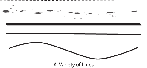
Firstly, line--This is a connection between point A and point B. It can be straight or curved, and it shows direction (or gives an impression of a direction, eg. a slanted line could look like it is going up or down).
Source: http://www.lumen-media.org/Sites/special/designNotes/images/lines.gif
Secondly, Shape--Connected lines to make a defined area. For example, a square is made up of four identical straight lines connected together at the ends; a circle is made up of one line joined at its ends and is curved.
Thirdly, tone and shade-- Tone and shade shows lightness or darkness and they can illustrate shadows and light, or the absence of light.
Source: https://blogger.googleusercontent.com/img/b/R29vZ2xl/AVvXsEjupfgEtn4Yc-CqUj4pcXzRWkSy29HV3W9UXyzSdlga9M8vnrk3VctMAovw9OAc4GzeJNxvvtjzu2_GZE73jbN7Ln8f_ISXIXRXEEtlDcKNKsN9QO7ZRm32q9C9e7IJn5tDAaJmuCiJurUV/s1600/bl+1.jpg
Fourthly, texture-- This is the different types of surface area of a shape which can be smooth like a pebble, or rough like a tire, sharp like the skin of a durian, soft like a teddy bear, hard like a ceramic plate and glossy like a glass window. Texture can be shown physically in statues or figures, or visually in photographs or paintings.
Lastly, perspective-- it shows the aspect of the artist or designer. Perspective plays a big role in design, because it can show one object in different ways just because of the difference in perspective.
Source: http://behance.vo.llnwd.net/profiles15/706274/projects/4770769/0795827520d60d933ad3ca6d37fef166.jpg
References:
Lovett, J. (1999). Design and colour. Retrieved from http://www.johnlovett.com/test.htm.


No comments:
Post a Comment