Saturday 29 June 2013

Design Project-- How Technology Affects Humans

Summary/Background about my design project: 

As the title of the design project was ‘How Technology Affects Humans’, I did some research on this topic. I read about how technology was not only limited to social media. Technology also meant the discovery of fire and how transportation came about. I got my idea when I was fetching a friend home after class. I thought about the evolution of transportation, how we used to walk instead of drive back in the past, and now we are so blessed with bicycles, trains and cars. So I went home and drew the diagram of the ‘evolution of transportation’.
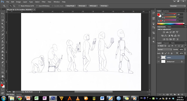
When I passed my drawings of my ideas up, Mr Azhar told me to merge my ideas of communication and evolution. That meant that I could draw the evolution of man diagram but instead, show the evolution of communication devices. In my final drawing, the primate begins with a tin can, which was one of the first ways humans communicated with another person who was at a distance from him. Then the second primate holds a phone which is connected to a case, which is a form of one of the earliest non-home-phone devices. Then a caveman holds a large, bulky cell phone which could be used without the huge case connected to it, then a cro-magnum is seen holding and looking at a clam-shell handphone, and then a more modern-looking man is seen holding an iPhone. Lastly, my lecturer said I could show a form of communication for the future and I chose a robot. This is because I think in the future, we would either be similar to robots or have our own personal robot to communicate more easily with others. 


Now I will outline the steps I took to make my final design project artwork.


Step 1:
The first thing I did was scan in my sketch and open the document in Photoshop (CS6). Then I made a new layer because I did not want to edit the actual sketch but instead colour the sketch in but in layers on top of it. 


Step 2:
Then I coloured each figure. So for the primate, I made a new layer and coloured it in with a brown colour. Then the second primate, I used a lighter brown. Then for the caveman I used another shade of brown, the cro-magnum was in a peach-kind of colour, the modern man was a sort of yellow, an the robot was silver.

I used the polygonal-selection tool to select the area I wanted to colour in, then I filled the area with the paint bucket tool. Then I changed the layer's blend mode to Multiply so that my sketch's outline can be seen.


Step 3: 
Then I started on the shading of the primate and also colouring in the communication devices. I decided to use red for the colour of the communication devices because red is really very striking and it will be the first thing the viewer looks at. This is because the communication device is the main thing I want people to focus on. After all, this artwork is about communication's evolution. 

So for shading, what I did was duplicate the layer of the primate and then that layer was actually a darker shade of brown, so I simply erased the darker brown from 'most' of the primate. So now it had it's original brown colour, but also with a darker shade where I left on the back, the stomach, the head and his feet. 
This was the same technique I used for the second primate and the caveman. I also did this shading technique for the communication devices, as you will see later on. 


Step 4:
Then after colouring in the tin can, I moved on to the second communication device. This is the 'mobile phone' with a case connected to it. I researched more about this device and it needed a case because of its large, bulky battery (http://www.telegraph.co.uk/technology/7906638/Mobile-phones-a-brief-history.html). [Side note: So we are actually so blessed now that our iPhone's and Samsung phones have small batteries that actually fit into the phone instead of outside of it in a huge brief-case. Imagine carrying that around a mall along with your handbag and shopping bags!!]

Once again, I did that shading with the double layer-trick. Plus, for the phone, I drew using the brush tool, the keypad and coloured it black. 


Step 5:
I shaded the caveman using the same double-layer way.


Step 6: 
I coloured in the bulky mobile phone and later drew in the outline with the brush tool.


Step 7:
I changed the cro-magnum's skin tone colour, this is because the previous colour was too pale and I thought that a cro-magnum would spend all day in the sun. Then I added hair all over his body with the brush tool. Then I also coloured in the clam-shell mobile phone and the iPhone. Notice that all the communication devices are the same shade of red. This is so that the viewer can easily see the evolution of the communication devices at one glance. 


Step 8: 
Finally, I added more normal looking hair to the human's head and gave him a little refined body with a line to show abs, using the brush tool for both the hair and the defined abs. 
I also gave the clam-shell phone and the iPhone more glossy looking screens. I did this by using the brush and changed the opacity of the brush. I recall learning in class that if we want to draw  glass, we should change the opacity so that it looks reflective and thus, glossy or shiny or see-through -- like glass. 


Step 9:
Lastly, I changed the colour of the robot's visor so that it is also red, along with the other communication devices. I did not change the robot as much as I changed the others because I felt that the robot had to look uniform and very straight forward as an object. It cannot look too complicated because it is a form of the future so we expect the future to make things much more simple and straightforward. I also used the brush to colour in the visor and I also changed the opacity because the visor is made of glass. 

And so there is my final design project artwork. 


Artist Statement:
Though I am not a professional artist, I tried my best in drawing out my idea of the evolution of communication. The main point this artwork is supposed to convey is that communication has improved over leaps and bounds. It has changed so much and for the better. I am glad that communication has evolved over the years, I cannot imagine carrying around a huge briefcase of just mobile phone battery! Also, one day I hope to be in direct contact with a robot that communicates and does things that humans cannot physically do. It will be amazing to watch and see it perform things we cannot only dream of today. 


References:
Monday 24 June 2013

Sketches-- How has technology affected our lives

The following pictures are of my five sketches, and one of which has been chosen to be my final design assignment piece.

Quality family time now looks like this, thanks to technology


We have become so unhealthy because of technology. Not only is this man eating fast food, he is microwaving it which means that it would be even more unhealthy than just eating fast food without reheating.


Nowadays, our devices have an app for almost everything. This is my interpretation of 'EVERYTHING'.


How has technology helped us for the better? We needn't know how to manually start a fire. Just press a button and ta-da!


The evolution of communication-- I guess it speaks for itself?

Monday 17 June 2013

Pop! Art!

This photo is of a Korean star from one of my favourite boybands BTOB.
I made a pop art out of one of his selca's, he posted on Twitter, using Photoshop.


Friday 14 June 2013

Photo montage!


This is a collage of seven photos (which I photographed myself). The main photo is of scenery I saw when I was in the car on my way outstation. Then the KLCC towers was when I visited there with my family. The umbrella is one from a seaside that I took a photo of when I was on a holiday.
The dog is my cousin's dog and the drink is a green tea smoothie, and the helicopter was a helicopter I saw when I went to KL. 
The picture of the slippers are my slippers, and I am the girl on the left of the collage picture.

Tuesday 11 June 2013

Art Movement

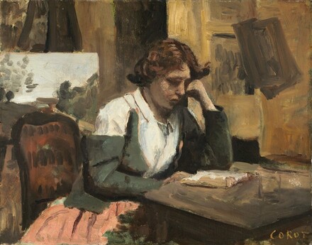
There are many types of art, types of genres and movements. One of the art movements I have come to like is Realism. The Realist Movement in art was most popular in France from 1840 to about 1890. Realism has the aim of conveying and communicating real life-- such as people, animals, and daily life as it appears in observable life-- through art. It mostly values truth and objectivity in portrayal of life in paintings.

The reason why this art movement stood out to me was that it is about humans and the reality of life. 


This painting is named 'Young Girl Reading'. 
It was painted by Camille Corot, and it was completed and revealed to the public in 1868. 
It shows girl intently reading at her desk
Source: http://media.nga.gov/public/objects/6/6/4/0/7/66407-primary-0-440x400.jpg


Realism is about the portrayal of people in their everyday lives, working, relaxing, at the market, walking and even just sitting down-- like these following realist paintings.

This painting was named 'Whistler's Mother' and it was painted by James Abbot McNeill Whistler. It was the painter's mother and because it didn't seem to have all the characteristics of a portrait, it was renamed 'Expression of black and grey'.


This painting was by the champion of Realism back in the day-- Gustave Courbet himself. It was completed in 1852. 
It shows three women walking in the fields, probably going toward the town, and meeting a younger girl along the way and giving her money. The cows are not perfect, and the women are not as beautiful as society would want them to be. That is the essence of realism. 


This painting was by Fernando Cueto Amorsolo and it is named 'Marketplace during the Occupation'. 
It was painted in 1942.
Ordinary, working class people, buying and selling at the marketplace.


This painting was by Francois Millet, and it was named 'The Gleaner'. 
It was painted in 1857.
It shows 3 workers gleaning from the harvest.


Realism was meant to show life through the eyes of the artist and his sensory observation of the 'real world'.  Realist artists desired to show in every detail the unpleasantness of life and experiences of 'normal, ordinary, everyday' people. Realism mostly was protest to the art movement of "Romanticism" which showed life in a very fantasy-like way. So the artists who subscribed to Realism instead, wanted to portray everyday life with all its imperfections. (Source: http://www.ducksters.com/history/art/realism.php).

An example of a Realist artist is Gustave Courbet (1819-1877). He put forward that painting should only  be of real and existent things and people. He was the main painter who promoted Realism back in his generation. Despite opposition from society who probably preferred Romanticism, he tried hard to illustrate in his paintings accurate scenes of ordinary people and places. (Source: http://www.metmuseum.org/toah/hd/rlsm/hd_rlsm.htm)

The Stonebreakers, painted in 1849 was done by Gustave Courbet. 

The Stonebreakers (1849)
This painting showed two humble men working hard at stonebreaking, without perfect features nor clothes. They are represented as truthfully as Gustave Courbet could represent them. 

References:
http://impressionist1877.tripod.com/realism.htm
http://www.starrabbott.com/article-realism-paintings.htm

Typography

Today Mr Khairuazhar taught us about typography. He showed us different types of typography and asked us to make our own typography, unique to each individual, by drawing on a piece of graph paper. We wrote/drew our names. I thought about how to design my name, and I thought about what I like about life in general. I thought about fancy typography, cute typography, and even large rounded typography.

But in the end I remembered that I like people-- children, adults, teenagers and the elderly!--which is partly why I am studying psychology in HELP. I am passionate about people. I also like observing human behaviour, learning about human behaviour and I like making friends. So, I decided. I would make a typography based on people. I am not good at drawing at all, but I tried my best. I googled people typography and found a few types which I kind of copied. I tried my best to make it unique to me though. I just hope you can see what I drew. :P


Shapes

For our assignment, we had to draw many basic shapes in order to form a picture. My picture is the alphabet 'K' which is actually both the initials of my name and surname. It is made up of rectangles, squares, flowers and circles.

I made sure that there was balance, because the many rectangles seem to be about equal to the flowers and the circles, so the whole picture does not lean only toward one side of the A4 page.

There is also repetition of the similar shapes, and also harmony because the shapes fit well together to form the alphabet 'K'.

Monday 10 June 2013

At the National Art Gallery

Growth 1964
Mixed media on paper, 67x57cm
Private collection

     This was the first piece of art I saw in the National Art Gallery which caught my attention. It is named ‘Growth’, and is a medium sized drawing, which shows different types of leaves growing together. Each leaf looked different from the others and they were all different heights and widths. They grew together from the bottom, but grew outward and at different lengths toward the top. The drawing has no colour, but I liked that about the drawing because it was simple yet it spoke lengths of meaning to me.
     It made me think of my life. I thought of my friends who grew up with me since we were young. I realized that we are all different and we grew in different, distinct stages. It didn't mean that one of us is in any way better than another. We are just diverse and unique. We grew and are growing in our own time and pace. Some of us are faster or taller, wider or older, and are each uniquely different. This drawing said so much to me in just one frame. 
     As a person who does not usually look so deeply into art, I am surprised that I was able to obtain so much and think so much just because of that piece of art. I vow to never underestimate any piece of art ever again. 


Someone forgotten (dream and reality)
1999
Oil paint
137x176cm national visual arts collection

     This painting was the last piece of art which caught my attention. It was in a section of the Art Gallery called "Absurd(c)ity". The art in this section was of more recent times and had a more modern feel than the other sections. This painting was of 9 elderly skinny men in a house. Two are lying down, the rest are squatting or sitting on the floor. I supposed that the 9 men was of different aspects of one man's life. 

     There are four young girls also in the painting and one elderly lady watching television in another room with one of the seated elderly men. There is a framed photograph on the floor of a family. And there is a middle aged couple looking into the house through a caged window. 
     This speaks to me by saying that sometimes we forget the elderly people. We lump them whether in word or thought or physical beings. We ought to be more thoughtful of them. We ought to consider them more. And appreciate them.

Tuesday 4 June 2013

Photograph of emotion

Source: http://www.rcoilliot.net/image/32387485785

This photograph elicits an emotion of loneliness. The man in the photograph stands outside the basketball court looking in. He has his arms folded, and seems to be only watching, not cheering or supporting. He does not seem to know anyone in the court. The photo is in black and white, to give the feeling of sadness and loneliness. One who looks at this picture cannot help but feel sad for the man and sympathize with him.

The story given to this picture:
This man has had a difficult life. He had to work from young without attending school. He doesn't know how to make friends. He never got the chance to learn how to be a child or how to interact with others when he was younger. He was kept from having fun and enjoying himself because of his many responsibilities. He had few friends. Most of his contact with others was with his siblings and parents. 

He never understood ‘social protocol’. He didn't know why people got angry at his honest comments. He didn't get why people wouldn't tell him their secrets or share their jokes with him. At work, people would eat lunch together but not include him in conversations. He didn't ask his family why people were so cruel, he thought they would be like that to them too.


Every day he would stop at the court in the middle of town and watch the young adults his age playing basketball together. They would have teams and call each other cool nicknames. They would thump one another on the back when they shot a ball into the hoop. He wished for a day when he would finally be able to join in. No one ever asks him to. So he just stands and watches. 

Monday 3 June 2013

My favourite colour: Blue

Blue.

Blue is the colour of the sky, the sea, blueberries, blue eyes and the great blue whale. Blue can be found in nature and makes blue a cool and natural colour. To me, blue signifies mystery, youth and calmness. I like blue because it makes me feel relaxed and not stressed. So when I look at the sky or the ocean, I feel very at peace and relaxed.


Source: http://www.hdwallpapers.in/walls/blue_sky_and_green_grass-wide.jpg


Source: https://blogger.googleusercontent.com/img/b/R29vZ2xl/AVvXsEiDq4fFIIbDPiytG2rii7qb70QTsBtY6UAUhGOGTR_CXAoic6RfwmkNXZ-vLXZ8WenPsQKdeL8dy6eQG33zvyWf5bWPG1o_nqDtgBItgoN84XJsur7hQtcG9pfhexnymybjXstoHOUpc-s/s1600/blue+sky+ocean+(9).jpg


Source: https://blogger.googleusercontent.com/img/b/R29vZ2xl/AVvXsEhCkSavBoBOVSco0XTT5cAqZjuCrRj_-5pYh2f7ORwlMN4bHllVF9C9lHbzJUiUzoIYRN6v9vRNX2AncZgSDKEOeQJikYrc0TZCVMHWtsKs6asm_TQYDObVLSicP0R3LSArK67gevwhBrCG/s1600/blue+whale+infoatinternet.blogspot.jpg

Source: http://thebestgardening.com/wp-content/uploads/2012/09/blueberries.png

Source: http://www.imagesangry.com/images/blue-eye-10.jpg

According to some religious beliefs, blue is symbolic of truth because it is related to good things and therefore anything celestial like the sky (Swedenborg, 1772). Blue is known to give off an opposite emotion to red. It makes people feel peace, tranquility and calmness (Johnson, 2007).

Source: http://farm1.staticflickr.com/185/385072761_7c8e7344cd_z.jpg


Some job consultants recommend people wearing blue to job interviews because it gives the symbolism of loyalty. Apparently people working in rooms with blue walls become more productive than in other types of rooms (Johnson, 2007). Also, people who work out in gyms are more motivated to work harder in gyms with blue walls (Johnson 2007).

Source : http://www.port.ac.uk/uopnews/wp-content/uploads/2012/07/Sport-and-rec-gym-from-inside-blue-walls.jpg


Though blue is mostly seen to be a positive colour, it can also be a sad colour. For example, people use the expression “I’m feeling blue today”, which means that he or she is feeling depressed or down. Also, like ice, it can also give off the impression of coldness toward others (Johnson, 2007).


Source: https://blogger.googleusercontent.com/img/b/R29vZ2xl/AVvXsEguudun8saXDr-3ABX0evUHY__pJMlMXD_gYxXadsfHifzl-bJ5kdbxhmfofm_-uouPR0m6gehJbf7Mqoum6j6G3aXw936M4cc7YP_rpJyESiRkDv_LmXdfm-Ka0kuj7XEwFY15vC9papvD/s1600/amazing-northern-lights-ice-water-landscape-beautiful-magical-white-blue-ocean-cold.jpg


References:
Johnson, D. (2007). Color psychology. Retrieved from www.infoplease.com/spot/colors1.html
Swedenborg, E. (1772). Spiritual meaning of blue. Retrieved from www.biblemeanings.info/Words/Colour/Blue.htm.

Saturday 1 June 2013

Design elements

My understanding of design elements:

There are quite a few principles and elements of design which consist of :

Principles such as:
     Firstly, contrast where two opposing colours or shapes are used to emphasize one over the other. For example, a black background and a white heart. The heart will be standing out because it contrasts the black background. 
Source: http://ak0.picdn.net/shutterstock/videos/3365429/preview/stock-footage-dynamic-white-hearts-s-animation-on-a-black-background-great-for-keying-or-masking.jpg


     The second principle is balance. It is necessary for so that the picture doesn't look lopsided or heavy to only one side. It is similar to the principle of math where one side's "weight" equals the other side. Also, it then requires the shape to be 'squarely in the middle' of the frame.    


Source: http://blogs.office.com/cfs-filesystemfile.ashx/__key/CommunityServer-Components-ImageFileViewer/CommunityServer-Blogs-Components-WeblogFiles-00-00-00-00-43/3683.balance.jpg_2D00_550x0.jpg


     Thirdly, there is alignment which is similar to balance because it requires equality. It is either that the words, pictures or shapes are on the left or the right of the whole picture. 
Source: https://blogger.googleusercontent.com/img/b/R29vZ2xl/AVvXsEh7V5V2oal9psf3rtx2fASS06hywjNd33exA0Tzu7pRX4kfNByFblwOR0elIftpkMUp1SkfbizX3XuDr0rQfrVc-L-Hq5yRzCFO_OfO0DsCHoMKxUsjHVH8Gj6w6UmiC7R5QyePIGbfhKuH/s1600/Campi_POD_03_Alignment.jpg


     Fourth is emphasis, which is similar to contrast because it means that something stands out over the background. 
Source: http://4.bp.blogspot.com/_MLzqQZGlq10/TVCvAqa1BxI/AAAAAAAAAAg/aGNT6ZuzMCY/s1600/gestalt-pattern-image_%2528_emphasis_%2529.jpg


     Fifth is gradation, where there is linear perspective of size and direction, and it is combined with tone and shade elements. Gradation shows difference in dark colours and light colours in one direction, whether linear or circular. 


     Sixth is repetition which can be done with varied styles or colours or without (which could turn out to be too monotonous). 


     Lastly there is harmony, dominance and unity. Harmony requires a combination of similar and related elements. Dominance gives emphasis and is the opposite of monotony, so it tells exactly what should be focused on. Unity ensures all the elements in the design fits well together, and all elements are cohesive. 
This following picture is very nice because it displays harmony, dominance and unity all at once. The harmony is illustration with the repeated lines, dominance is illustrated with the random bright coloured lines and lastly, unity ensures everything flows together and are nicely fitted in one picture.


Elements such as:
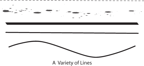
     Firstly, line--This is a connection between point A and point B. It can be straight or curved, and it shows direction (or gives an impression of a direction, eg. a slanted line could look like it is going up or down). 
Source: http://www.lumen-media.org/Sites/special/designNotes/images/lines.gif


     Secondly, Shape--Connected lines to make a defined area. For example, a square is made up of four identical straight lines connected together at the ends; a circle is made up of one line joined at its ends and is curved. 


     Thirdly, tone and shade-- Tone and shade shows lightness or darkness and they can illustrate shadows and light, or the absence of light. 
Source: https://blogger.googleusercontent.com/img/b/R29vZ2xl/AVvXsEjupfgEtn4Yc-CqUj4pcXzRWkSy29HV3W9UXyzSdlga9M8vnrk3VctMAovw9OAc4GzeJNxvvtjzu2_GZE73jbN7Ln8f_ISXIXRXEEtlDcKNKsN9QO7ZRm32q9C9e7IJn5tDAaJmuCiJurUV/s1600/bl+1.jpg


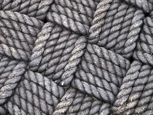
     Fourthly, texture-- This is the different types of surface area of a shape which can be smooth like a pebble, or rough like a tire, sharp like the skin of a durian, soft like a teddy bear, hard like a ceramic plate and glossy like a glass window. Texture can be shown physically in statues or figures, or visually in photographs or paintings. 


     Lastly, perspective-- it shows the aspect of the artist or designer. Perspective plays a big role in design, because it can show one object in different ways just because of the difference in perspective. 


References:

Lovett, J. (1999). Design and colour. Retrieved from http://www.johnlovett.com/test.htm.


Wednesday 29 May 2013

Abstract Art

Created in a heat of frustration with the computer lab's spastic mouse, on the 28th of May, I present:


Kim's Abstract Art


I used about 5 layers in photoshop, and used the 'gradient' tool, albeit overused but fortunately it all worked out. I used the circle gradient, square gradient and just changed the property of the layer to 'exclusion'.


Actually to me, the two large squares, toward the bottom of the picture, look like they are colliding with on another and I think it gives a strong feeling. A strong feeling of either passion or anger. The black colour makes the picture have a bold look and the pinkish purple colour makes the picture look kind of feminine in a way.