Monday, 10 June 2013

At the National Art Gallery

Growth 1964
Mixed media on paper, 67x57cm
Private collection

     This was the first piece of art I saw in the National Art Gallery which caught my attention. It is named ‘Growth’, and is a medium sized drawing, which shows different types of leaves growing together. Each leaf looked different from the others and they were all different heights and widths. They grew together from the bottom, but grew outward and at different lengths toward the top. The drawing has no colour, but I liked that about the drawing because it was simple yet it spoke lengths of meaning to me.
     It made me think of my life. I thought of my friends who grew up with me since we were young. I realized that we are all different and we grew in different, distinct stages. It didn't mean that one of us is in any way better than another. We are just diverse and unique. We grew and are growing in our own time and pace. Some of us are faster or taller, wider or older, and are each uniquely different. This drawing said so much to me in just one frame. 
     As a person who does not usually look so deeply into art, I am surprised that I was able to obtain so much and think so much just because of that piece of art. I vow to never underestimate any piece of art ever again. 


Someone forgotten (dream and reality)
1999
Oil paint
137x176cm national visual arts collection

     This painting was the last piece of art which caught my attention. It was in a section of the Art Gallery called "Absurd(c)ity". The art in this section was of more recent times and had a more modern feel than the other sections. This painting was of 9 elderly skinny men in a house. Two are lying down, the rest are squatting or sitting on the floor. I supposed that the 9 men was of different aspects of one man's life. 

     There are four young girls also in the painting and one elderly lady watching television in another room with one of the seated elderly men. There is a framed photograph on the floor of a family. And there is a middle aged couple looking into the house through a caged window. 
     This speaks to me by saying that sometimes we forget the elderly people. We lump them whether in word or thought or physical beings. We ought to be more thoughtful of them. We ought to consider them more. And appreciate them.

Tuesday, 4 June 2013

Photograph of emotion

Source: http://www.rcoilliot.net/image/32387485785

This photograph elicits an emotion of loneliness. The man in the photograph stands outside the basketball court looking in. He has his arms folded, and seems to be only watching, not cheering or supporting. He does not seem to know anyone in the court. The photo is in black and white, to give the feeling of sadness and loneliness. One who looks at this picture cannot help but feel sad for the man and sympathize with him.

The story given to this picture:
This man has had a difficult life. He had to work from young without attending school. He doesn't know how to make friends. He never got the chance to learn how to be a child or how to interact with others when he was younger. He was kept from having fun and enjoying himself because of his many responsibilities. He had few friends. Most of his contact with others was with his siblings and parents. 

He never understood ‘social protocol’. He didn't know why people got angry at his honest comments. He didn't get why people wouldn't tell him their secrets or share their jokes with him. At work, people would eat lunch together but not include him in conversations. He didn't ask his family why people were so cruel, he thought they would be like that to them too.


Every day he would stop at the court in the middle of town and watch the young adults his age playing basketball together. They would have teams and call each other cool nicknames. They would thump one another on the back when they shot a ball into the hoop. He wished for a day when he would finally be able to join in. No one ever asks him to. So he just stands and watches. 

Monday, 3 June 2013

My favourite colour: Blue

Blue.

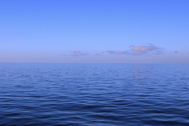
Blue is the colour of the sky, the sea, blueberries, blue eyes and the great blue whale. Blue can be found in nature and makes blue a cool and natural colour. To me, blue signifies mystery, youth and calmness. I like blue because it makes me feel relaxed and not stressed. So when I look at the sky or the ocean, I feel very at peace and relaxed.


Source: http://www.hdwallpapers.in/walls/blue_sky_and_green_grass-wide.jpg


Source: https://blogger.googleusercontent.com/img/b/R29vZ2xl/AVvXsEiDq4fFIIbDPiytG2rii7qb70QTsBtY6UAUhGOGTR_CXAoic6RfwmkNXZ-vLXZ8WenPsQKdeL8dy6eQG33zvyWf5bWPG1o_nqDtgBItgoN84XJsur7hQtcG9pfhexnymybjXstoHOUpc-s/s1600/blue+sky+ocean+(9).jpg


Source: https://blogger.googleusercontent.com/img/b/R29vZ2xl/AVvXsEhCkSavBoBOVSco0XTT5cAqZjuCrRj_-5pYh2f7ORwlMN4bHllVF9C9lHbzJUiUzoIYRN6v9vRNX2AncZgSDKEOeQJikYrc0TZCVMHWtsKs6asm_TQYDObVLSicP0R3LSArK67gevwhBrCG/s1600/blue+whale+infoatinternet.blogspot.jpg

Source: http://thebestgardening.com/wp-content/uploads/2012/09/blueberries.png

Source: http://www.imagesangry.com/images/blue-eye-10.jpg

According to some religious beliefs, blue is symbolic of truth because it is related to good things and therefore anything celestial like the sky (Swedenborg, 1772). Blue is known to give off an opposite emotion to red. It makes people feel peace, tranquility and calmness (Johnson, 2007).

Source: http://farm1.staticflickr.com/185/385072761_7c8e7344cd_z.jpg


Some job consultants recommend people wearing blue to job interviews because it gives the symbolism of loyalty. Apparently people working in rooms with blue walls become more productive than in other types of rooms (Johnson, 2007). Also, people who work out in gyms are more motivated to work harder in gyms with blue walls (Johnson 2007).

Source : http://www.port.ac.uk/uopnews/wp-content/uploads/2012/07/Sport-and-rec-gym-from-inside-blue-walls.jpg


Though blue is mostly seen to be a positive colour, it can also be a sad colour. For example, people use the expression “I’m feeling blue today”, which means that he or she is feeling depressed or down. Also, like ice, it can also give off the impression of coldness toward others (Johnson, 2007).


Source: https://blogger.googleusercontent.com/img/b/R29vZ2xl/AVvXsEguudun8saXDr-3ABX0evUHY__pJMlMXD_gYxXadsfHifzl-bJ5kdbxhmfofm_-uouPR0m6gehJbf7Mqoum6j6G3aXw936M4cc7YP_rpJyESiRkDv_LmXdfm-Ka0kuj7XEwFY15vC9papvD/s1600/amazing-northern-lights-ice-water-landscape-beautiful-magical-white-blue-ocean-cold.jpg


References:
Johnson, D. (2007). Color psychology. Retrieved from www.infoplease.com/spot/colors1.html
Swedenborg, E. (1772). Spiritual meaning of blue. Retrieved from www.biblemeanings.info/Words/Colour/Blue.htm.

Saturday, 1 June 2013

Design elements

My understanding of design elements:

There are quite a few principles and elements of design which consist of :

Principles such as:
     Firstly, contrast where two opposing colours or shapes are used to emphasize one over the other. For example, a black background and a white heart. The heart will be standing out because it contrasts the black background. 
Source: http://ak0.picdn.net/shutterstock/videos/3365429/preview/stock-footage-dynamic-white-hearts-s-animation-on-a-black-background-great-for-keying-or-masking.jpg


     The second principle is balance. It is necessary for so that the picture doesn't look lopsided or heavy to only one side. It is similar to the principle of math where one side's "weight" equals the other side. Also, it then requires the shape to be 'squarely in the middle' of the frame.    


Source: http://blogs.office.com/cfs-filesystemfile.ashx/__key/CommunityServer-Components-ImageFileViewer/CommunityServer-Blogs-Components-WeblogFiles-00-00-00-00-43/3683.balance.jpg_2D00_550x0.jpg


     Thirdly, there is alignment which is similar to balance because it requires equality. It is either that the words, pictures or shapes are on the left or the right of the whole picture. 
Source: https://blogger.googleusercontent.com/img/b/R29vZ2xl/AVvXsEh7V5V2oal9psf3rtx2fASS06hywjNd33exA0Tzu7pRX4kfNByFblwOR0elIftpkMUp1SkfbizX3XuDr0rQfrVc-L-Hq5yRzCFO_OfO0DsCHoMKxUsjHVH8Gj6w6UmiC7R5QyePIGbfhKuH/s1600/Campi_POD_03_Alignment.jpg


     Fourth is emphasis, which is similar to contrast because it means that something stands out over the background. 
Source: http://4.bp.blogspot.com/_MLzqQZGlq10/TVCvAqa1BxI/AAAAAAAAAAg/aGNT6ZuzMCY/s1600/gestalt-pattern-image_%2528_emphasis_%2529.jpg


     Fifth is gradation, where there is linear perspective of size and direction, and it is combined with tone and shade elements. Gradation shows difference in dark colours and light colours in one direction, whether linear or circular. 


     Sixth is repetition which can be done with varied styles or colours or without (which could turn out to be too monotonous). 


     Lastly there is harmony, dominance and unity. Harmony requires a combination of similar and related elements. Dominance gives emphasis and is the opposite of monotony, so it tells exactly what should be focused on. Unity ensures all the elements in the design fits well together, and all elements are cohesive. 
This following picture is very nice because it displays harmony, dominance and unity all at once. The harmony is illustration with the repeated lines, dominance is illustrated with the random bright coloured lines and lastly, unity ensures everything flows together and are nicely fitted in one picture.


Elements such as:
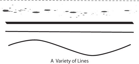
     Firstly, line--This is a connection between point A and point B. It can be straight or curved, and it shows direction (or gives an impression of a direction, eg. a slanted line could look like it is going up or down). 
Source: http://www.lumen-media.org/Sites/special/designNotes/images/lines.gif


     Secondly, Shape--Connected lines to make a defined area. For example, a square is made up of four identical straight lines connected together at the ends; a circle is made up of one line joined at its ends and is curved. 


     Thirdly, tone and shade-- Tone and shade shows lightness or darkness and they can illustrate shadows and light, or the absence of light. 
Source: https://blogger.googleusercontent.com/img/b/R29vZ2xl/AVvXsEjupfgEtn4Yc-CqUj4pcXzRWkSy29HV3W9UXyzSdlga9M8vnrk3VctMAovw9OAc4GzeJNxvvtjzu2_GZE73jbN7Ln8f_ISXIXRXEEtlDcKNKsN9QO7ZRm32q9C9e7IJn5tDAaJmuCiJurUV/s1600/bl+1.jpg


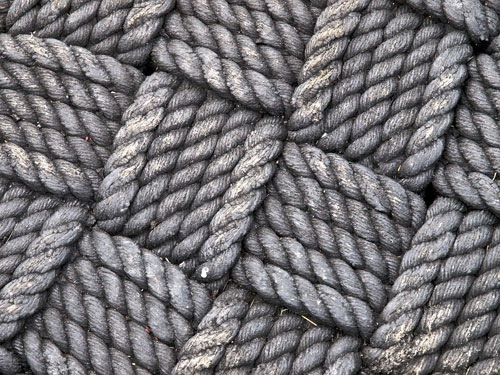
     Fourthly, texture-- This is the different types of surface area of a shape which can be smooth like a pebble, or rough like a tire, sharp like the skin of a durian, soft like a teddy bear, hard like a ceramic plate and glossy like a glass window. Texture can be shown physically in statues or figures, or visually in photographs or paintings. 


     Lastly, perspective-- it shows the aspect of the artist or designer. Perspective plays a big role in design, because it can show one object in different ways just because of the difference in perspective. 


References:

Lovett, J. (1999). Design and colour. Retrieved from http://www.johnlovett.com/test.htm.


Wednesday, 29 May 2013

Abstract Art

Created in a heat of frustration with the computer lab's spastic mouse, on the 28th of May, I present:


Kim's Abstract Art


I used about 5 layers in photoshop, and used the 'gradient' tool, albeit overused but fortunately it all worked out. I used the circle gradient, square gradient and just changed the property of the layer to 'exclusion'.


Actually to me, the two large squares, toward the bottom of the picture, look like they are colliding with on another and I think it gives a strong feeling. A strong feeling of either passion or anger. The black colour makes the picture have a bold look and the pinkish purple colour makes the picture look kind of feminine in a way.